Dark Mode
Chameleon was blocking the release of dark mode in customers applications because it wasn't easy to style the in-apps.
2025
Summary: An interesting example of rapid research undertaken when a design was in-flight to help me make the best decision.
Situation
- Chameleon was receiving significant customer feedback that the platform was blocking dark mode releases in their applications due to difficult in-app styling.
- Dark mode had become a highly emotive priority for customers, creating urgency around finding a solution.
- The existing theming system wasn't equipped to handle the requirements of dark mode implementation.
Task
- Explore and design a dark mode solution that would integrate with Chameleon's existing infrastructure.
- Determine the most effective approach for implementing dark mode without disrupting current workflows.
- Ensure the solution would be intuitive for designers with varying technical backgrounds.
Action
- I researched and mapped out related concepts and potential approaches.
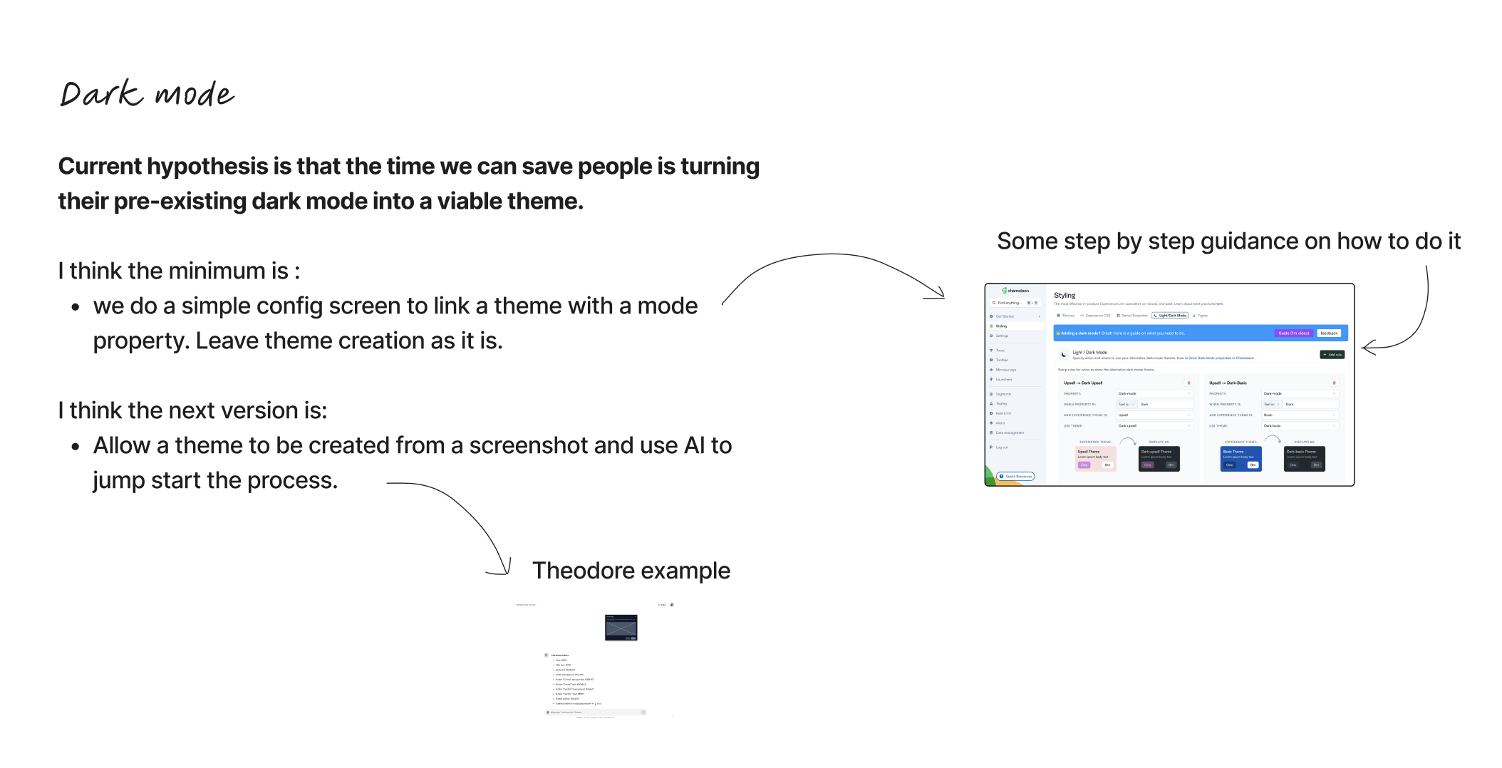
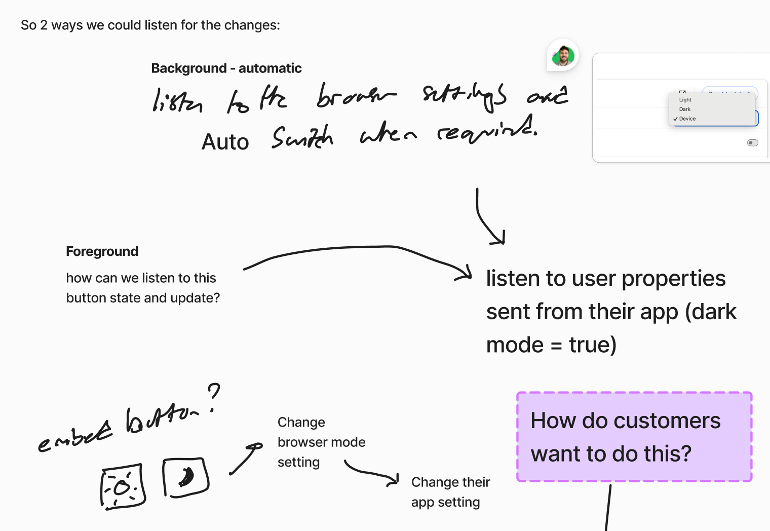
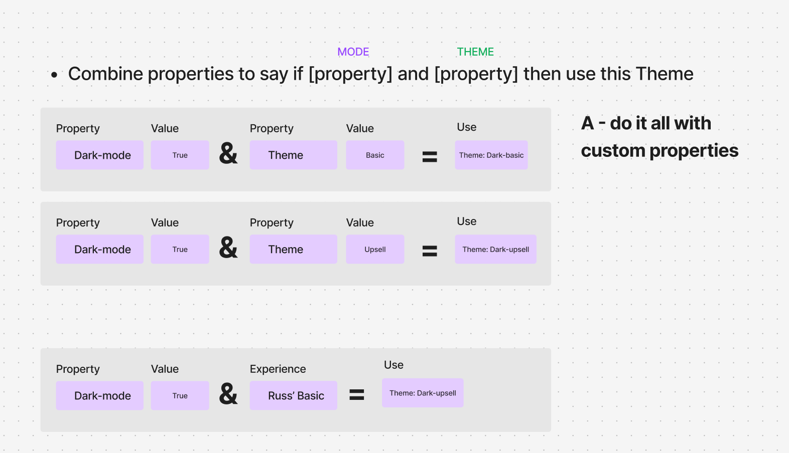
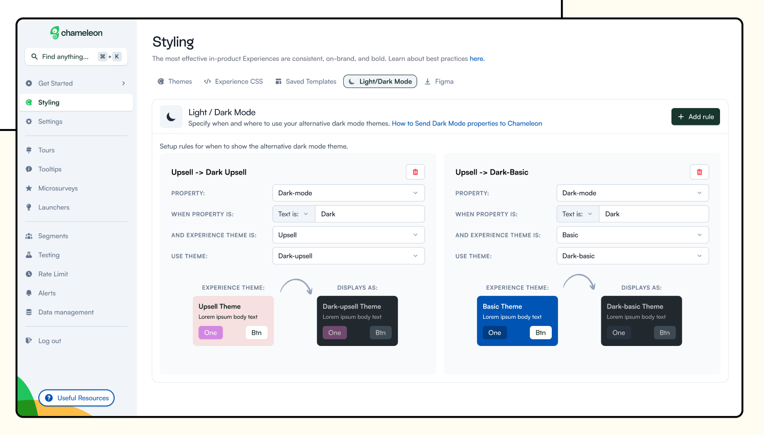
- I identified two core problems to solve: the trigger mechanism (what tells the system to deliver dark theme) and the theme itself (what the dark version looks like).
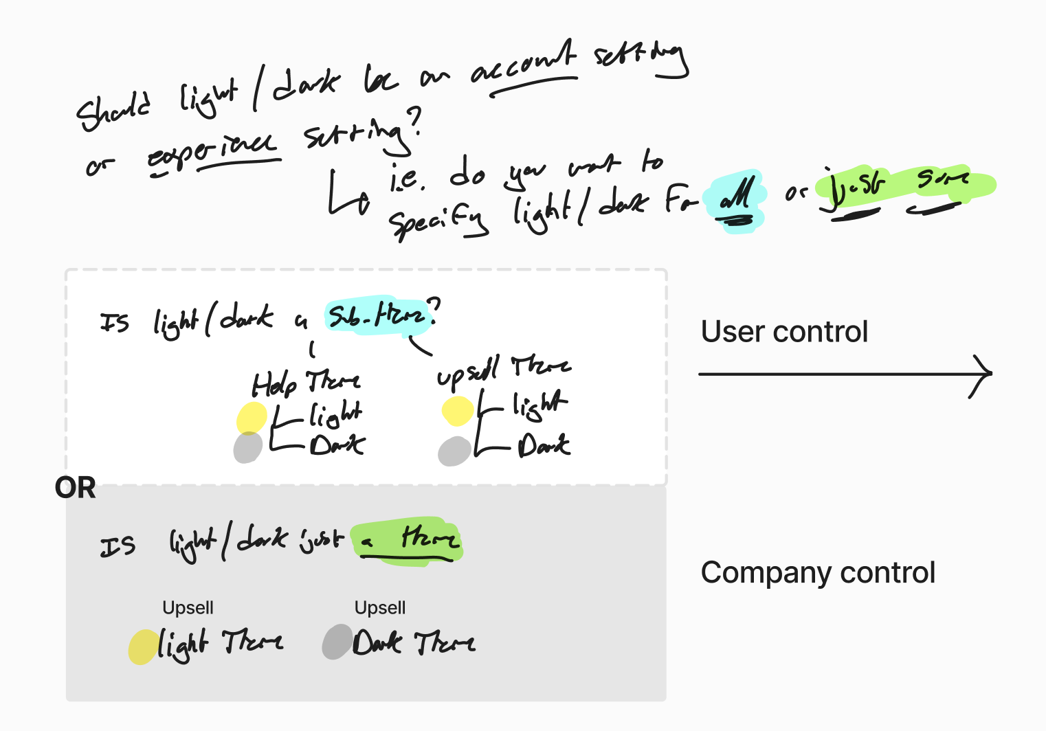
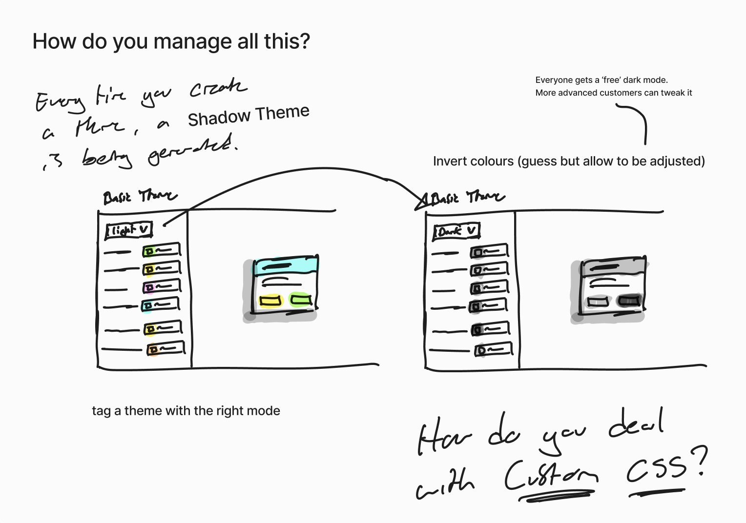
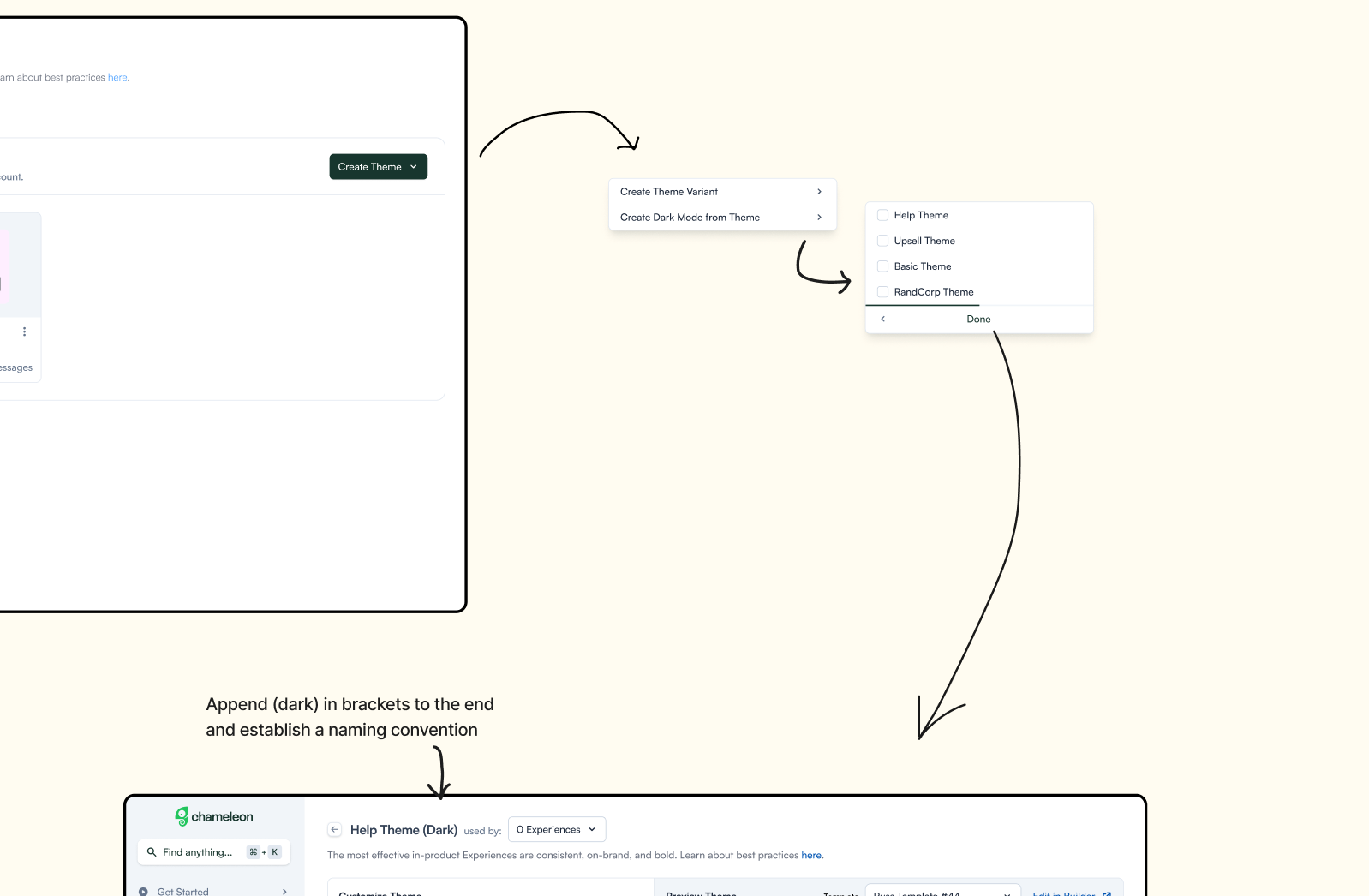
- I developed two distinct solution options: "Shadow Themes" (each theme has configurable shadow colors for dark mode) and "Dark Mode as a Theme" (leveraging existing theme functionality with theme layering).
- I recognized the need for more customer data to make an informed choice
- I designed and executed comprehensive user research using in-app experiences, existing designer contacts, and Userinterviews.com
- I created targeted survey questions to understand: color relationship dependencies, brand color change frequency, Figma dark mode workflows, and non-color modifications.
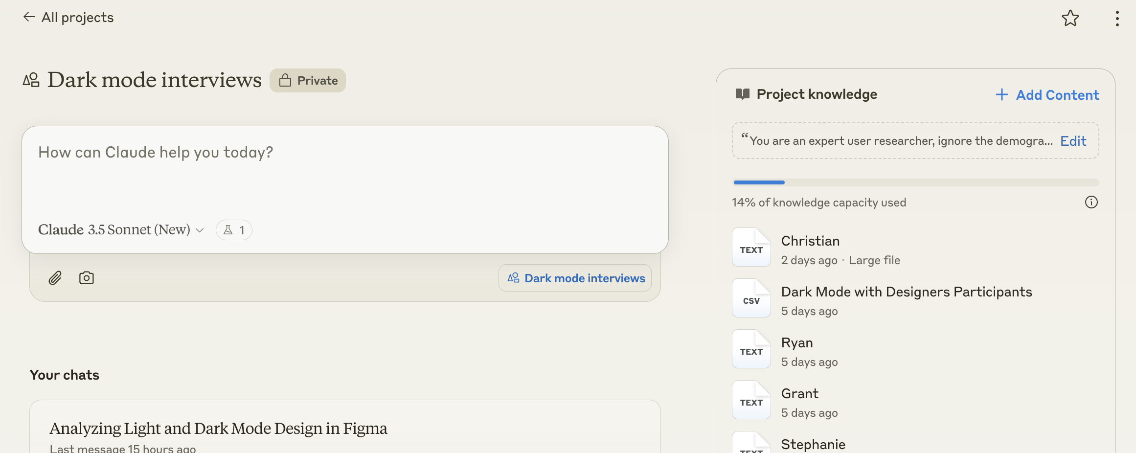
- I used Claude.ai to analyze interview transcripts and create concise, shareable research summaries.
- I pivoted approach based on research findings that showed color schemes weren't related and designers already had created themes in Figma.
- I explored design token import functionality and AI-powered theme extraction from screenshots.
- I prototyped a custom GPT that could generate theme styles from screenshots.
Result
- Research clearly validated "Dark Mode as a Theme" as the optimal solution over Shadow Themes approach.
- I discovered that color inversion was unreliable and unnecessary since designers had already created their dark themes.
- Identified AI-powered theme extraction as a value-add opportunity that could save customer time and add delight to the experience.
- I established a clear technical direction that leveraged existing infrastructure while solving the dark mode blocking issue.
- I created the foundation for onboarding improvements using the same AI extraction technology to set a Theme during account setup.
The Long Version
The Brief
We had lots of feedback that Chameleon was blocking the release of dark mode in a customers application because it wasn't easy to style the in-apps. Since dark mode is a highly emotive thing when it's a priority, we decided to explore how we might add dark mode to Chameleon Themes.
Explore
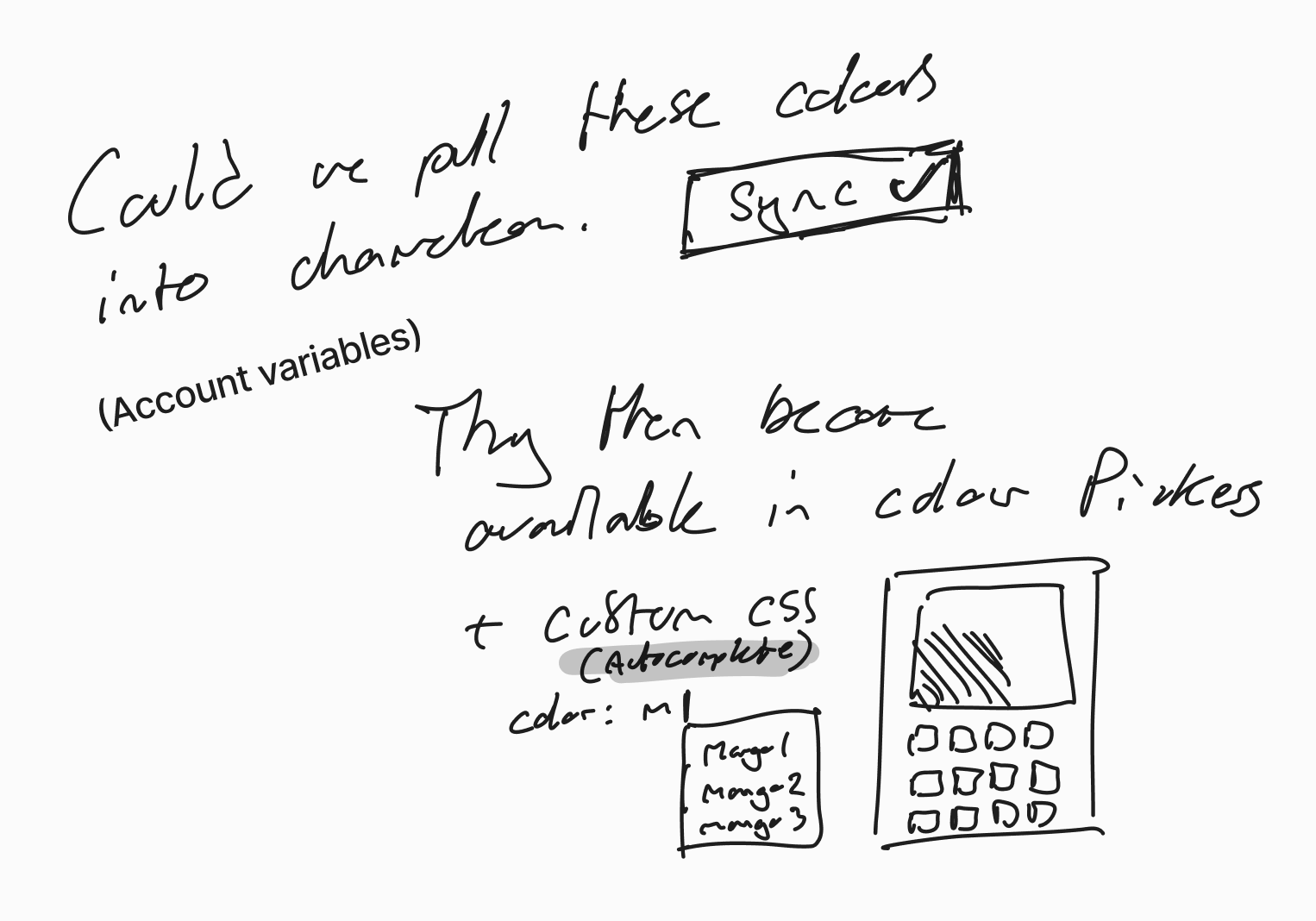
This project started out (as most projects do) with a loose brain dump of ideas and related concepts:
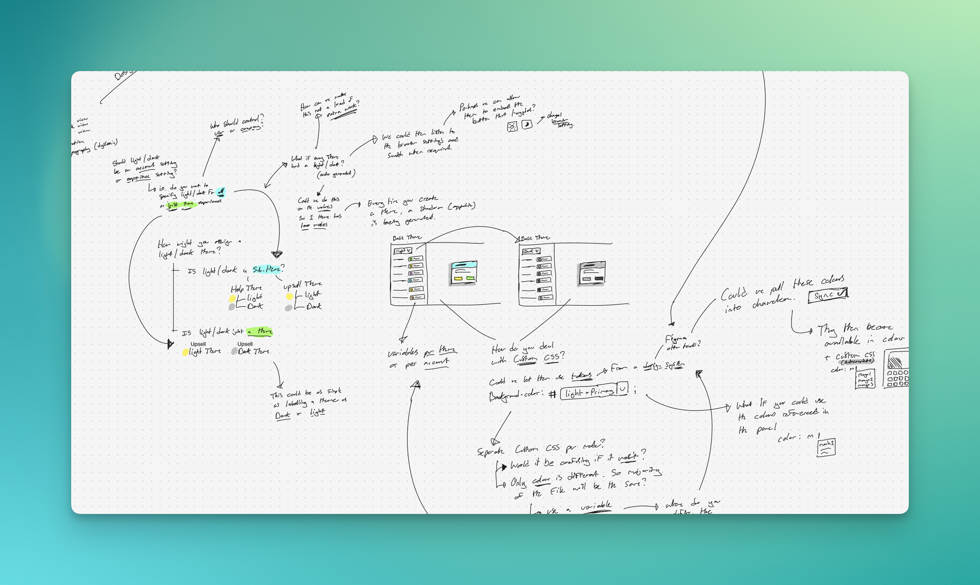
Then I started to research the related concepts:
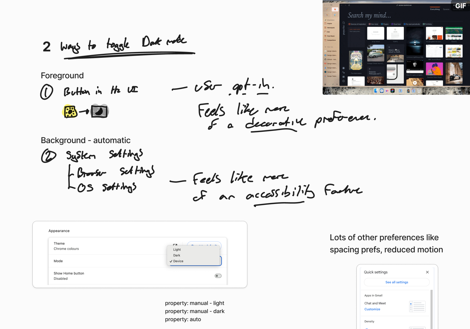
I established that there were two main problems we needed to solve:
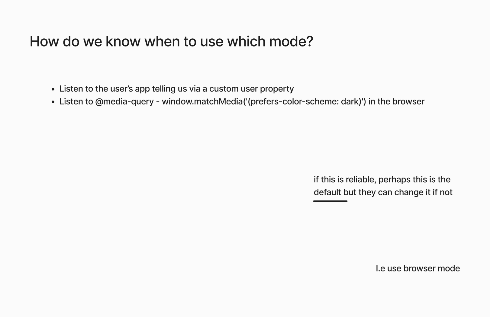
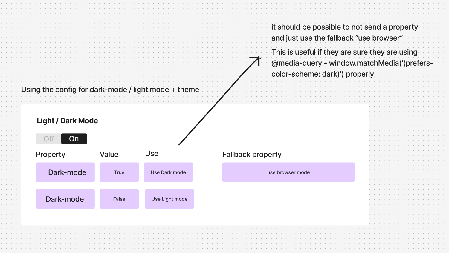
- The trigger - what is going to tell us to deliver a dark theme?
- The dark theme - what is the new theme going to look like?
The Trigger
The Theme
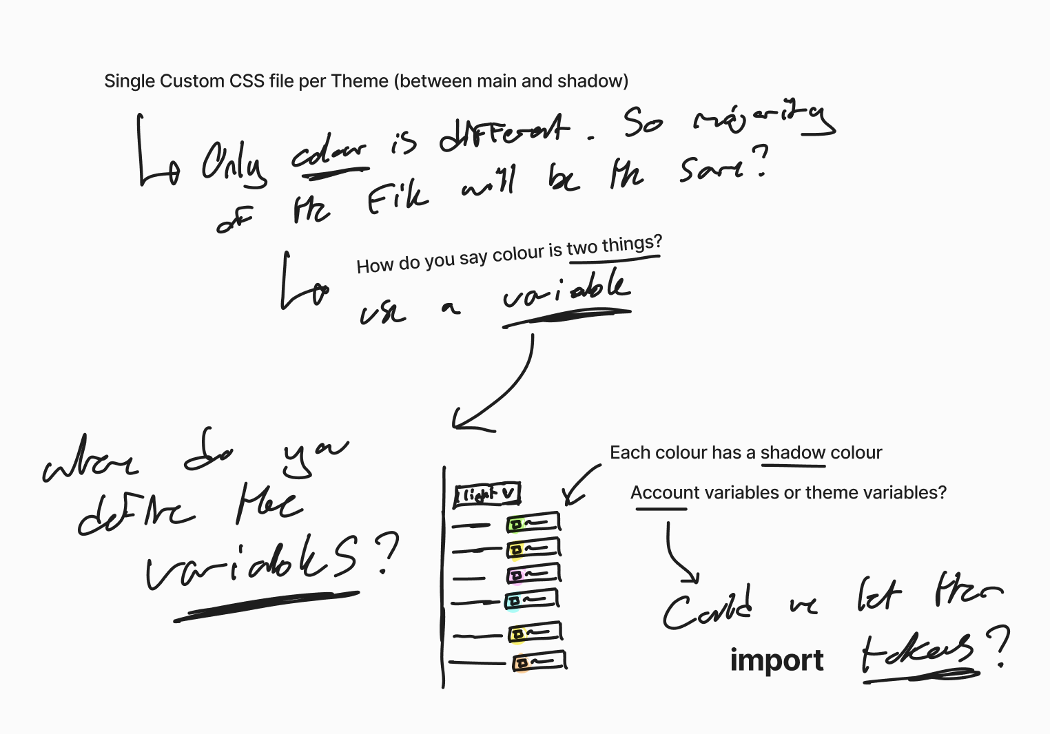
I got really focused on colour mapping and excited by the idea of adding variables.
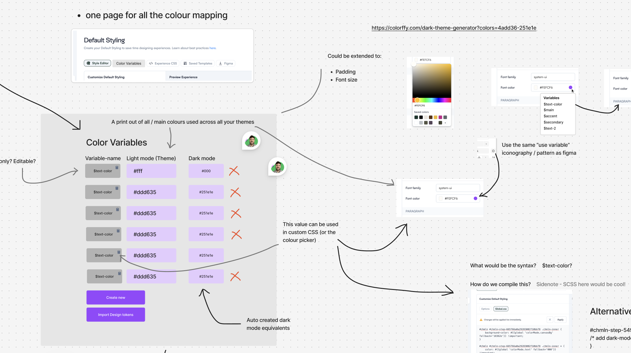
These explorations, coupled with several deep discussions with the tech teams about the technical feasibility of various things led to two very different options. I gave them names to aid discussion: 'Shadow Themes' and 'DarkMode as a Theme'
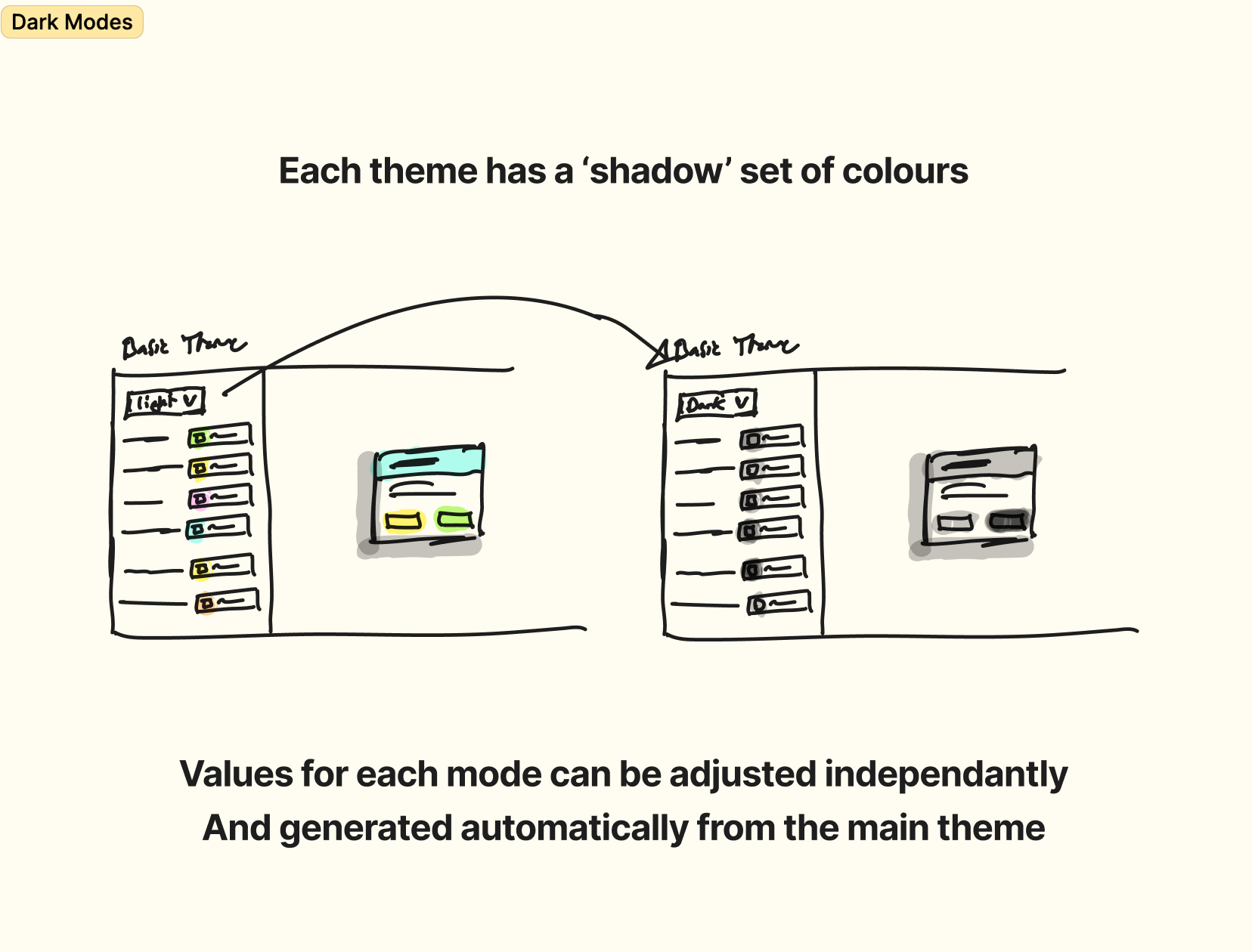
Option A - Shadow Themes
Each Theme would have a 'shadow' set of colours that could be configured to provide a dark mode.
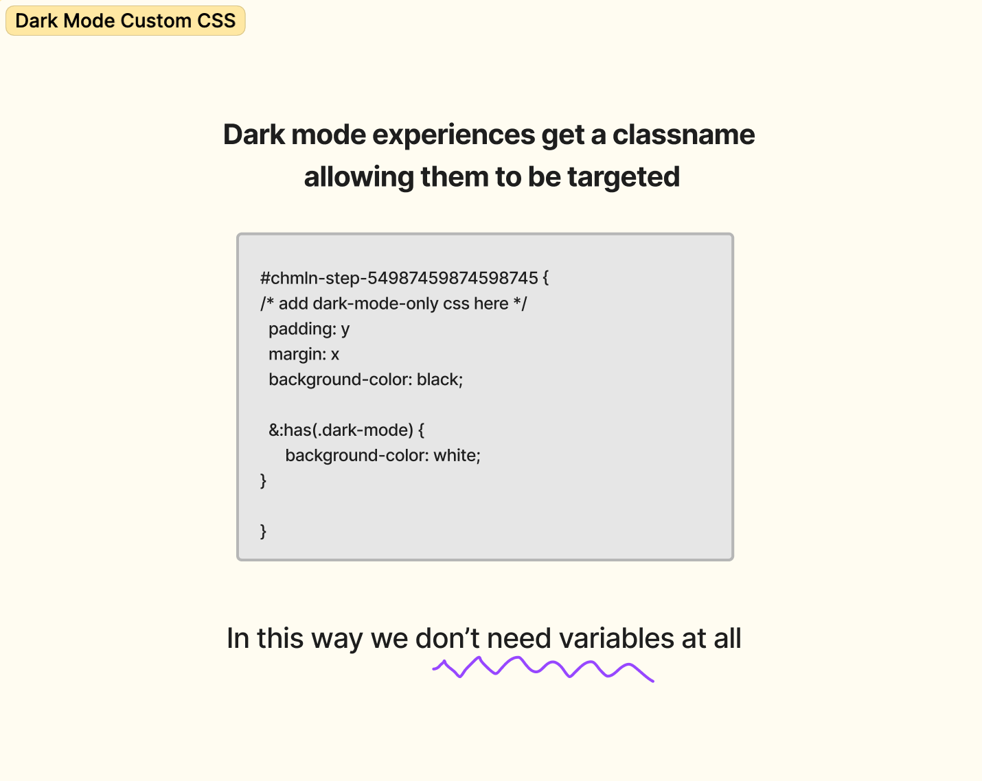
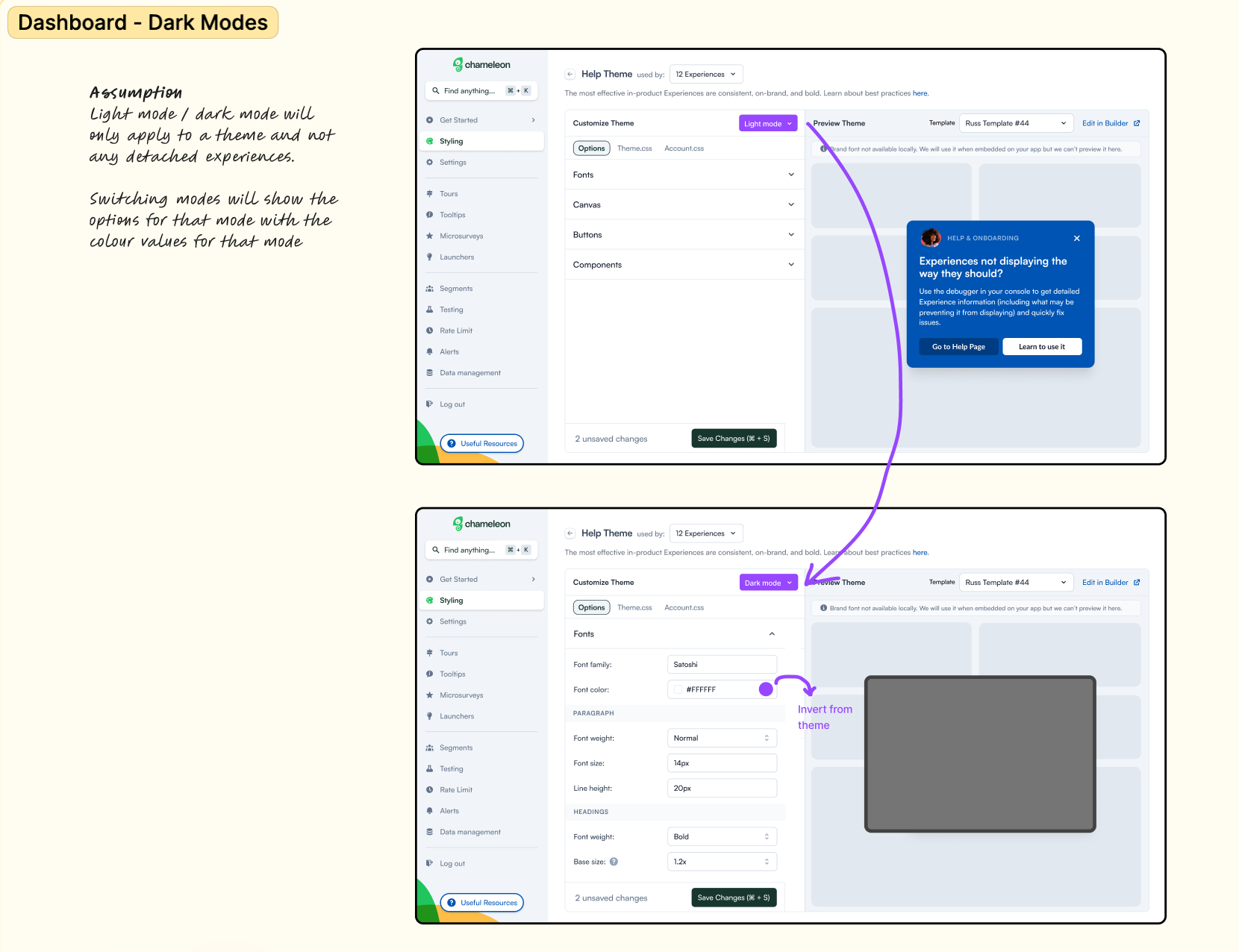
Option B - Dark mode as a Theme
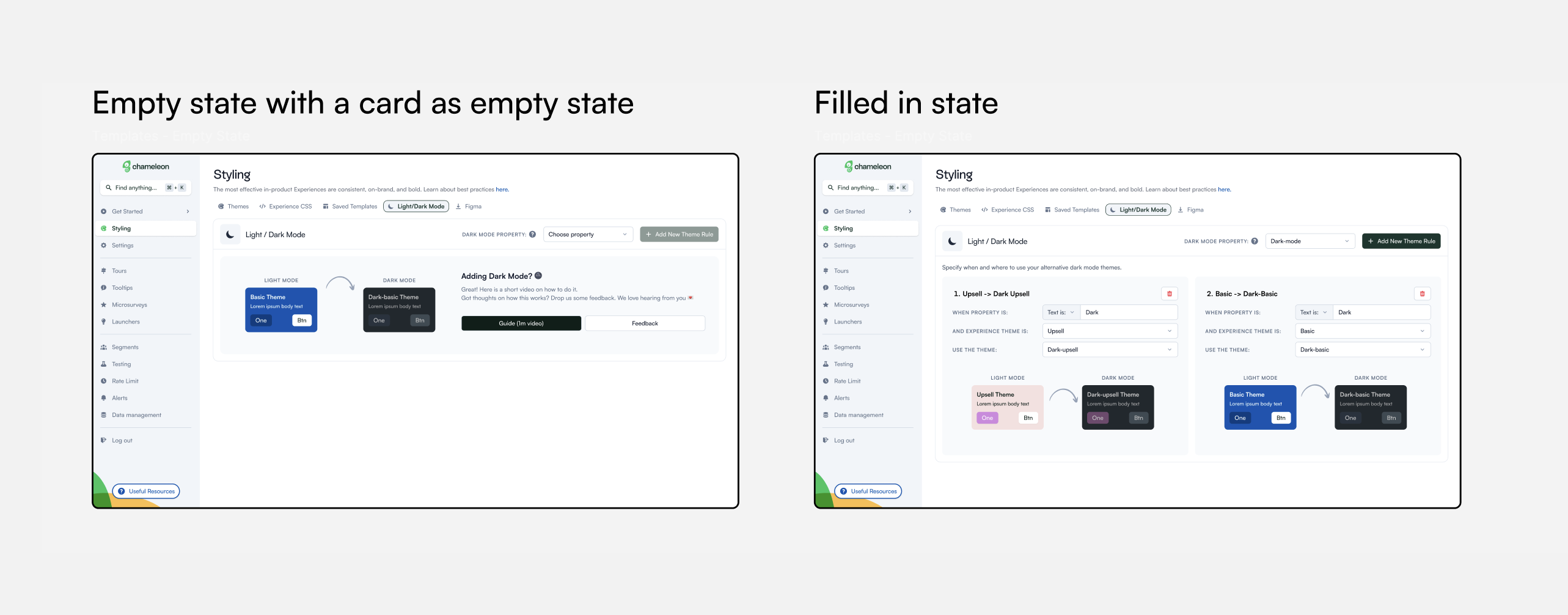
We leverage the existing Themes functionality and allow certain Themes to be configured to be used over another.
A critical point
This was a critical point, after discussion with the product team we decided we didn't have enough information to answer some crucial questions that would make this decision easy.
I started some research to find out:
- Are dark mode and light mode related? Does changing the colour of one necessitate a change in another? A yes here means a big tick for Shadow Themes.
- Do people make many changes to their brand colours?
- How do people manage dark modes in Figma?
- Do people change things other than Colour? A yes here would make "Dark as a Theme" a preferable option.
I used a mix of in-app experiences to target designers in Chameleon, our existing bank of designers we had spoken to and Userinterviews.com. I also did a quick survey asking the key questions.
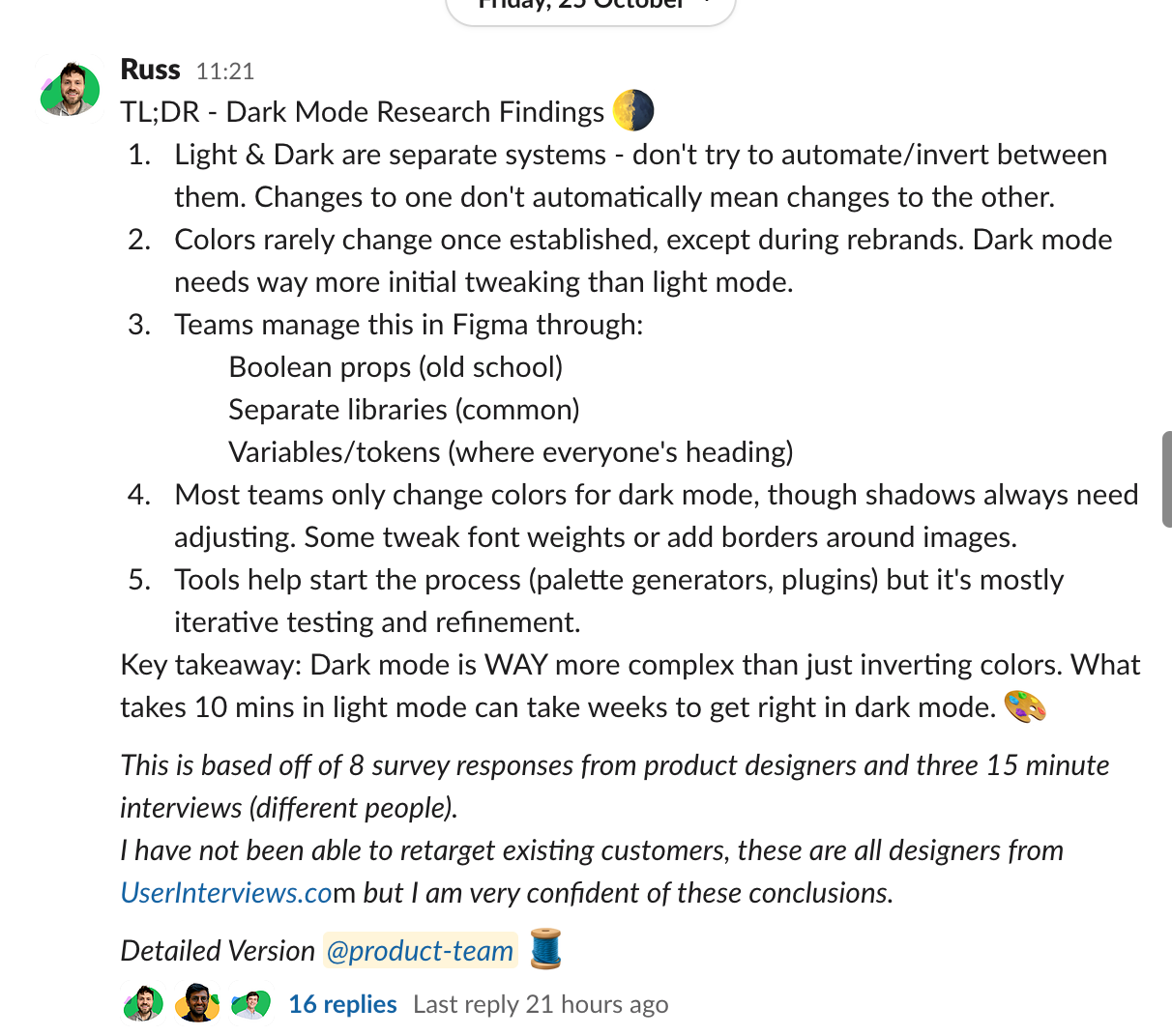
Plugging the interview transcripts into Claude.ai allowed me to quickly analyze the results and create a very concise sharable summary.
New information
This research really upended my perspective on the problem. Firstly it made it clear that Shadow Themes wasn't a good fit, colour schemes were not related and using 'inversion' to create a theme was unreliable and unnecessary. Designers had already created the Theme and were only looking to implement it in Chameleon.
So the job to be done became very simply: How do we enable designers to create a dark theme from their figma file?
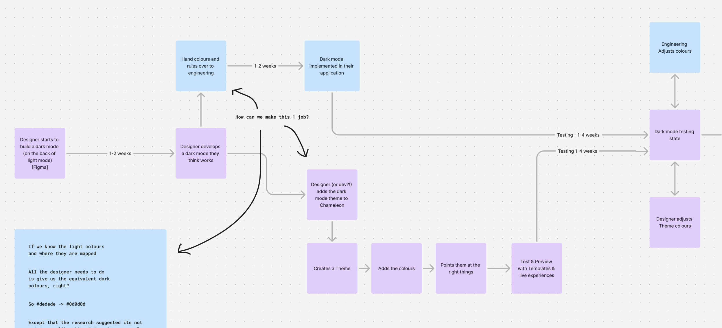
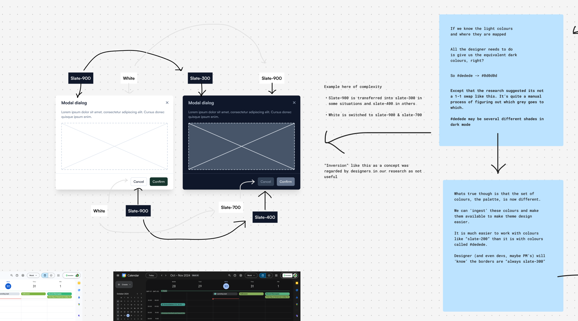
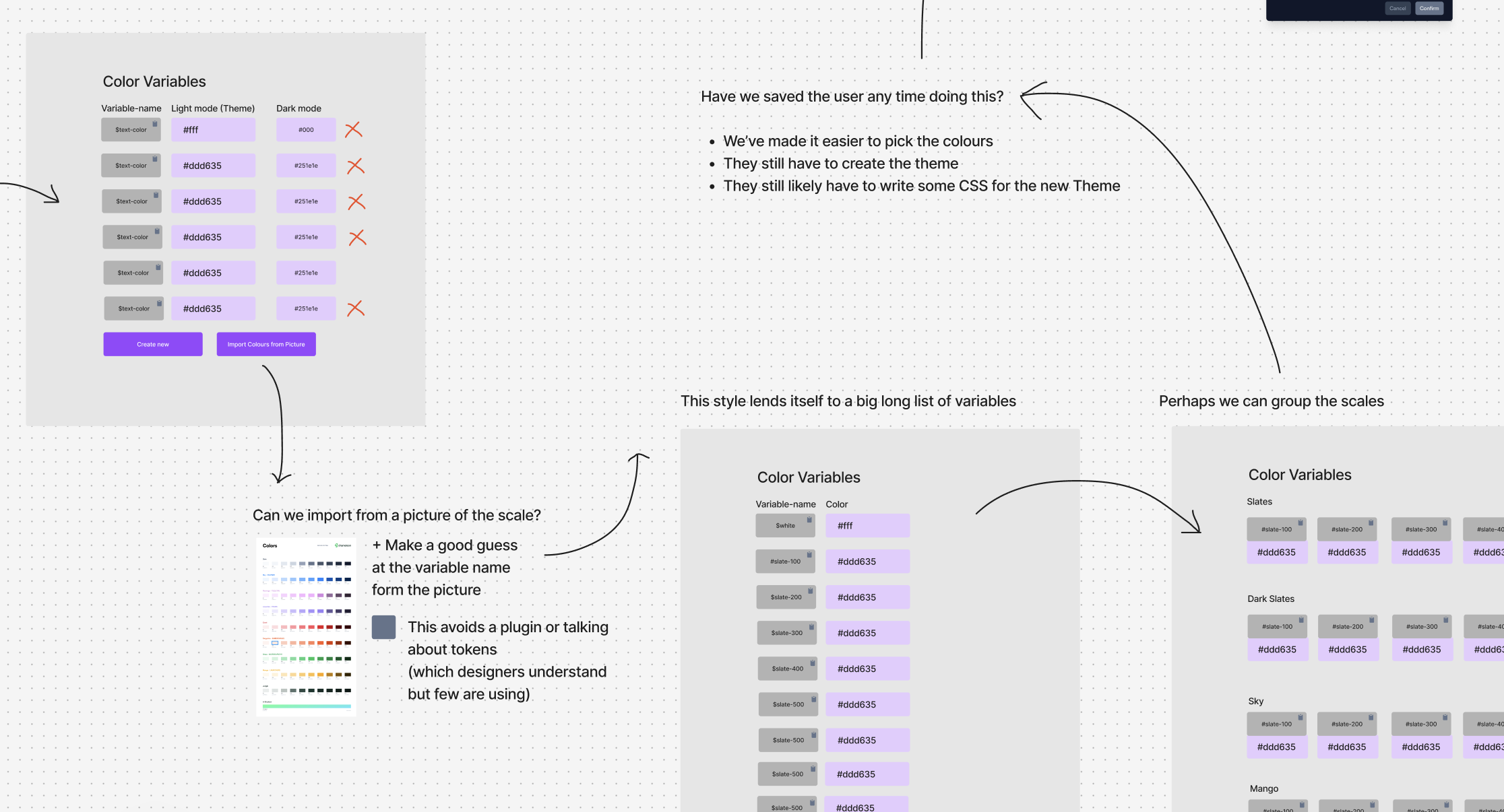
I went back to my work with variables, and explored how we might import design tokens. Our research showed that designers were increasingly aware of tokens and variables but it was quite aspirational, not well used.
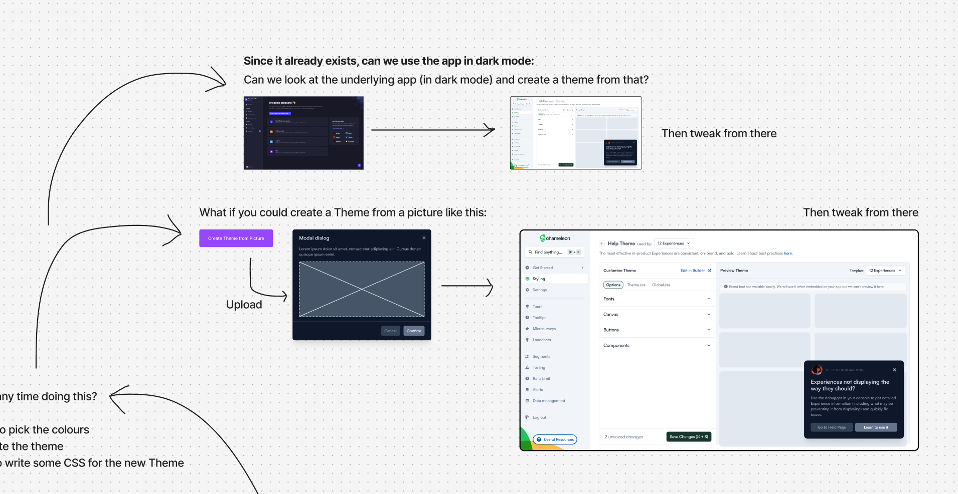
In thinking about how to extract colours from a picture I hit upon the idea of using AI to extract a theme from a simple screenshot of a modal.
Prototyping
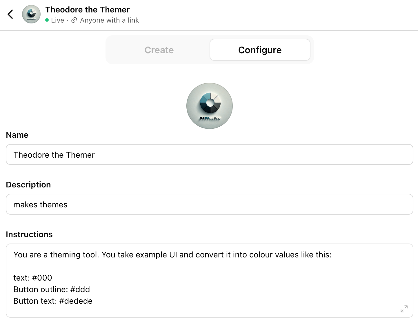
I prototyped a custom GPT that would take a screenshot and output the exact theme styles we needed. This idea opened up possibilities in the onboarding experience too.

Summary
The decision was clear that using "Dark Mode as a Theme" was the right way to go. We would also continue to prototype using AI to create the theme. This was an area we felt we could best save customers time and add some delight.
